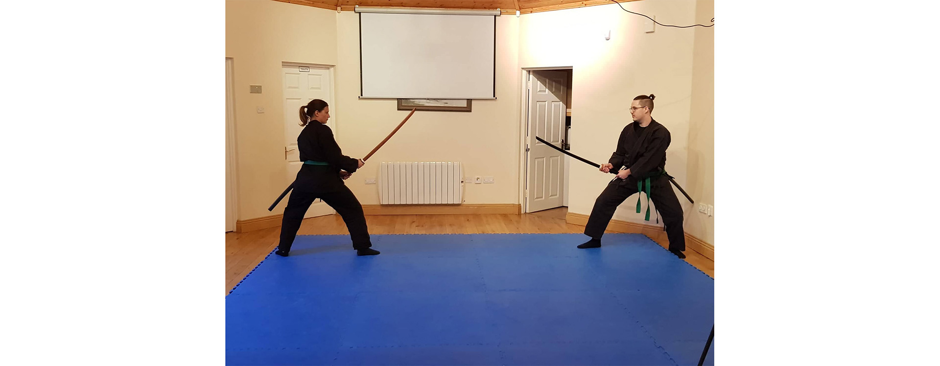
The Bujinkan is a Japanese martial art. Unlike karate from Okinawa island. The Bujinkan teaches Budo (warrior way) Taijutsu (body technique). Comprising of nine historic samurai and ninja schools. The dojo I was asked to work for was recently opened and looking to advertise and get new students, while developing a sense of community and belonging. There were two main areas I looked at. The first was how they appeared online. This included their Facebook page, student group page, courses advertised on Facebook and materials for monthly workshops. The second part was developing the sense of community. I approached this by designing apparel. This could be purchased and worn by students or be used to celebrate specific workshops or events in the future. This in tern would help the running costs of the dojo as a bonus.
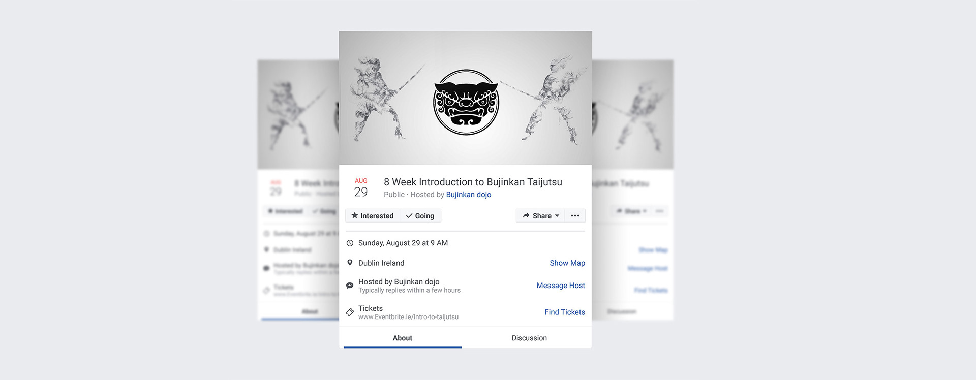
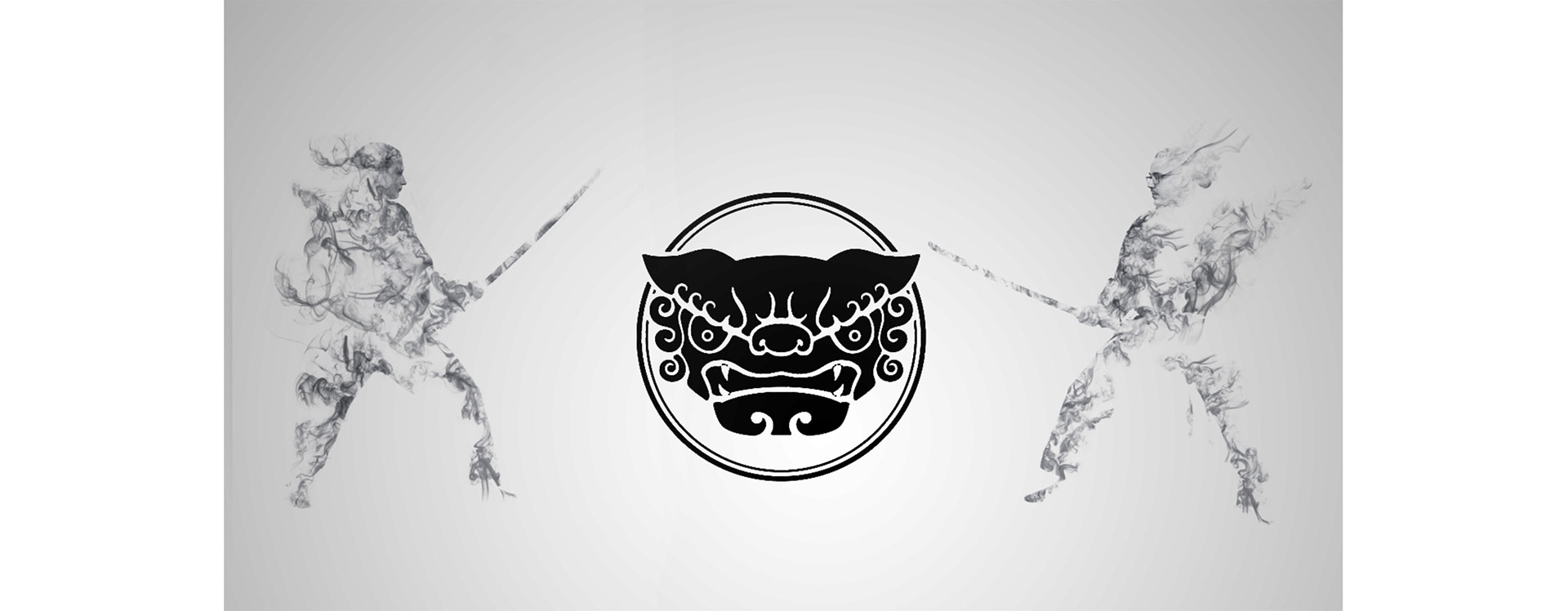
Above is one of the smoke images I created for the martial art dojo. I had to heavily edit the source photo to get the final image. I made sure to preserve the faces of both students. My goal was to convey the culture of the martial art in the Facebook event and give the image some real stopping power that grabs your attention. This photo was taken by myself. The rest of the photos were taken by the client. The circular logo was previously created by Redbloc Design. I recreated it and in the above image changed it to black.
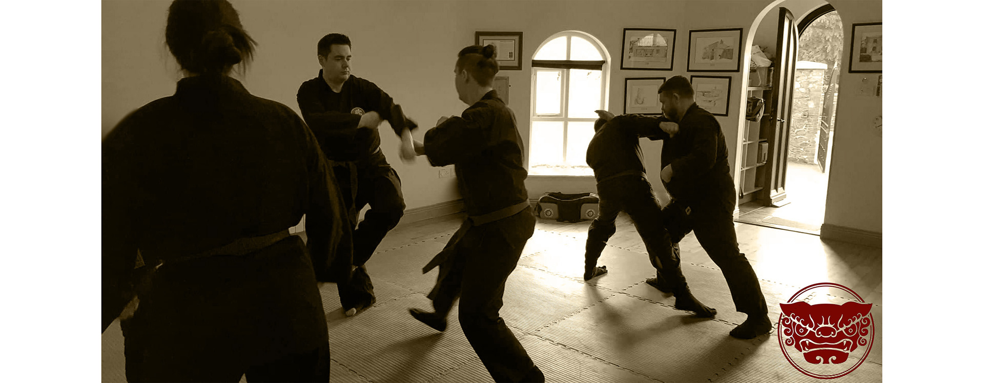
Above is one of the photos I was asked to retouch and edit. I was asked to remove one student who was partially out of the frame along with tidy up and debris on the window sill. I also defined the outline of some students a bit more because they are all wearing black. The building had a harsh mix of natural light and fluorescent lighting, so I changed it to a sepia tone to add atmosphere and warm the photo up.


Above is the edited and retouched photo. I removed bathroom doors, screens and debris. I changed it to a sepia tone to warm the photos up and give it some atmosphere because the building uses harsh fluorescent lighting. Below is the unedited photo for comparison.

The above is one of the two smoke images I created. The idea was to make enticing imagery that will catch someone’s eye on Facebook. Then get them interested in joining a beginner course in the martial art. Below is the original source image.

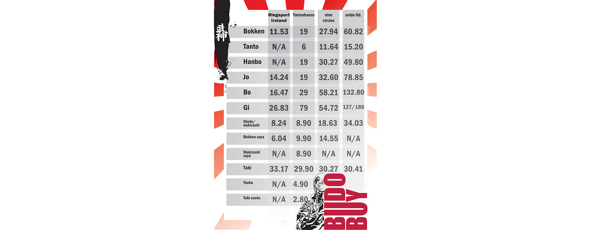
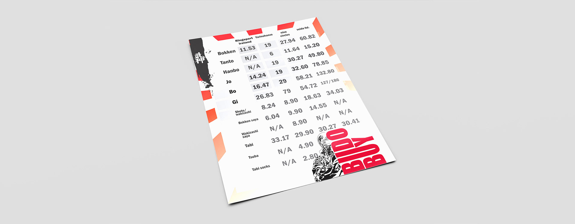
Above is a flyer I created for new students as well as students looking to buy new equipment. In the Bujinkan they train with weapons so students, a dojo or multiple dojos will often do group buys to reduce shipping costs. I took a list of the most commonly needed equipment from the recommended suppliers. The background is based off of the rising sun, and I designed and illustrated the budo buy ninja. I tried making it look like one of the street flyers you might get handed in Japan out side a shop.
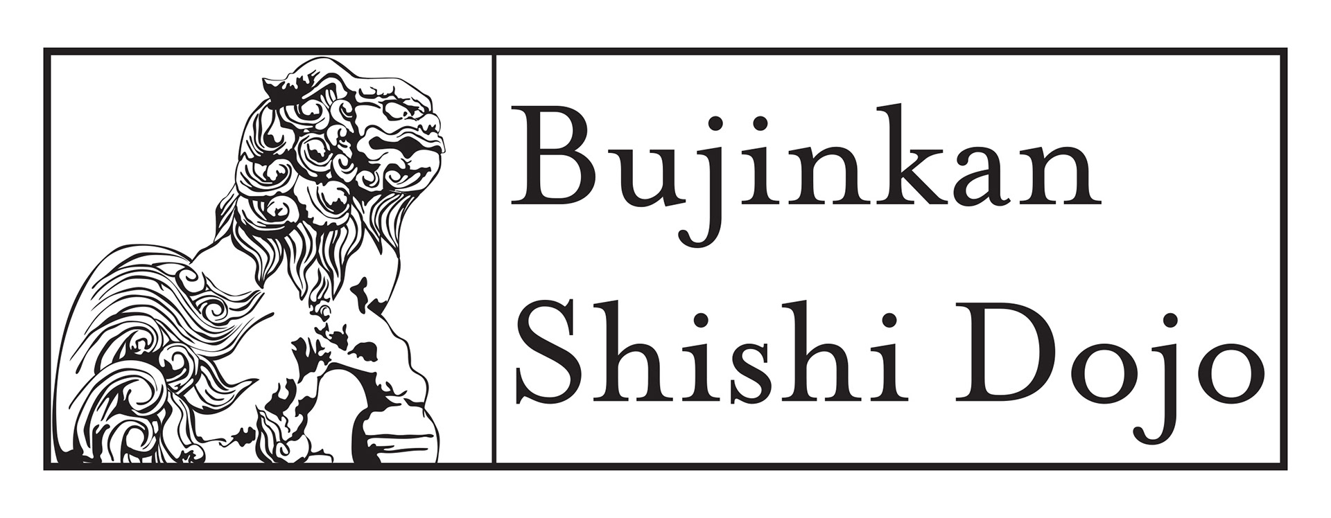
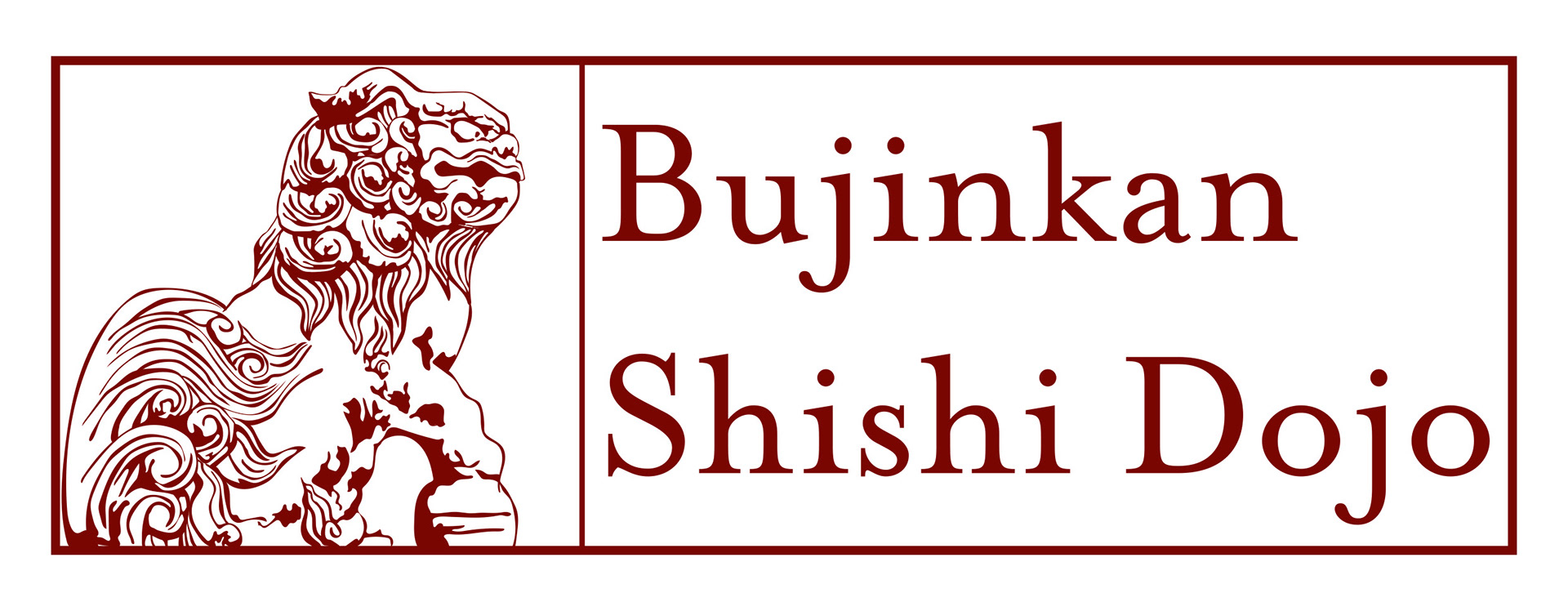
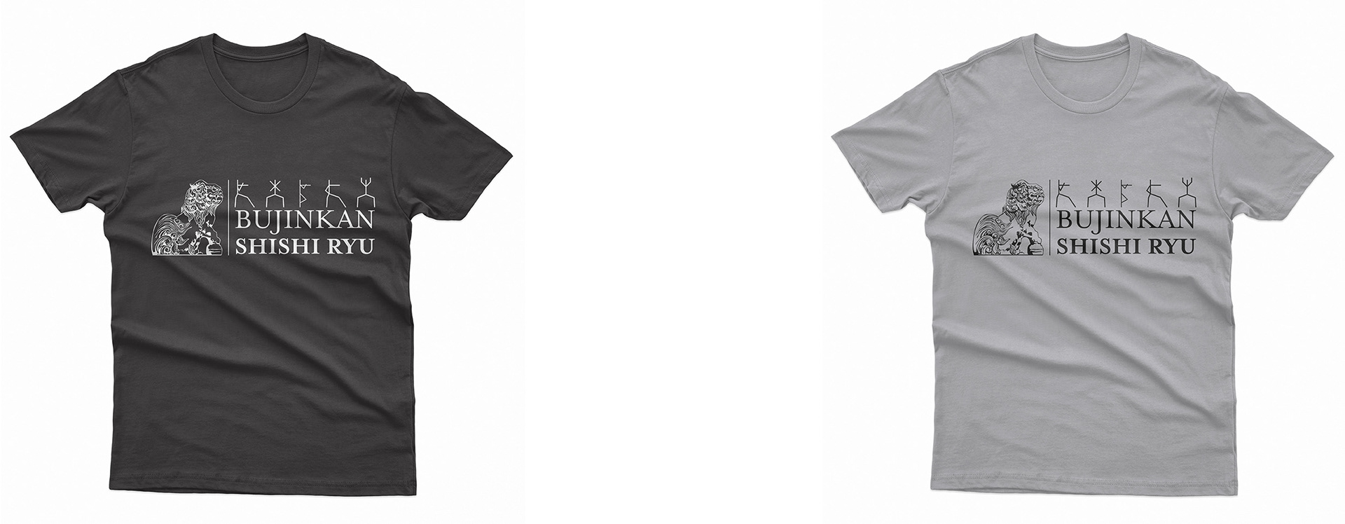
Above are two colour options of a banner I created for their Facebook pages. The version below I made as the version for their student group page. It incorporates different stances.
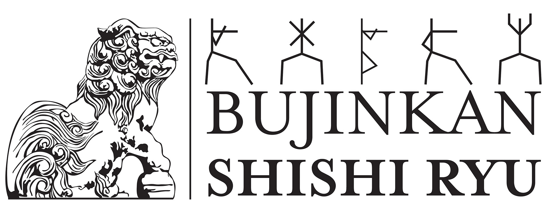

Above is a process shot of illustrating the Shishi. The dojo was the Bujinkan Shishi Ryu. The Shishi are a common symbol in Japanese culture as a protective lion dog.

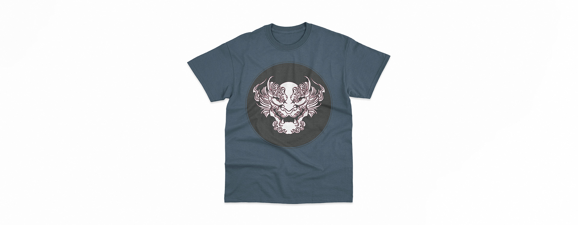
One of the shishi I designed can be seen above. I made it facing head on and placed it in a square with rounded corners. This was to make it seem like Japanese hanko and inkan, a personal seal and stamp.
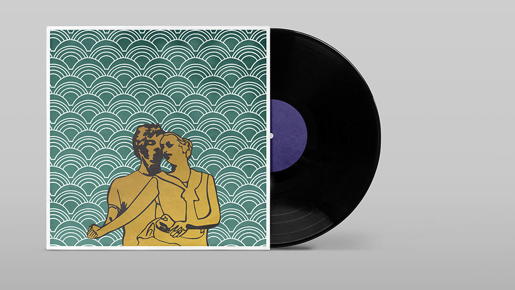
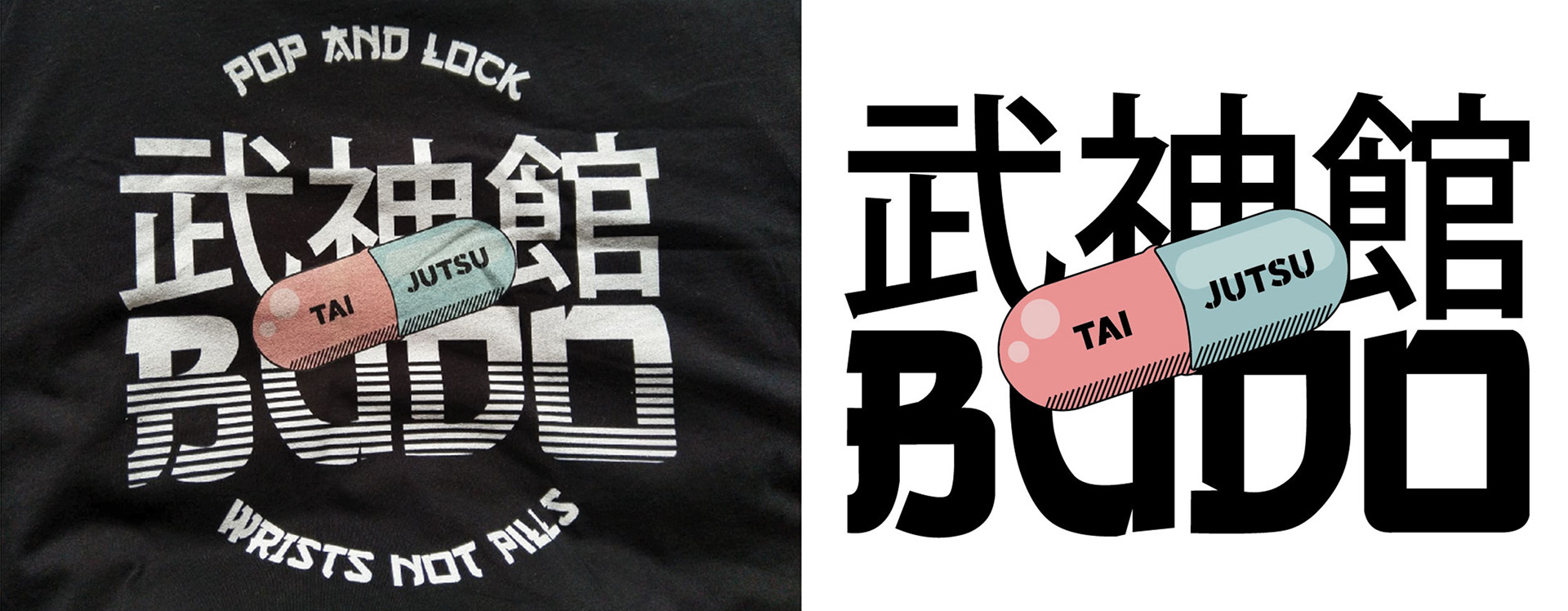
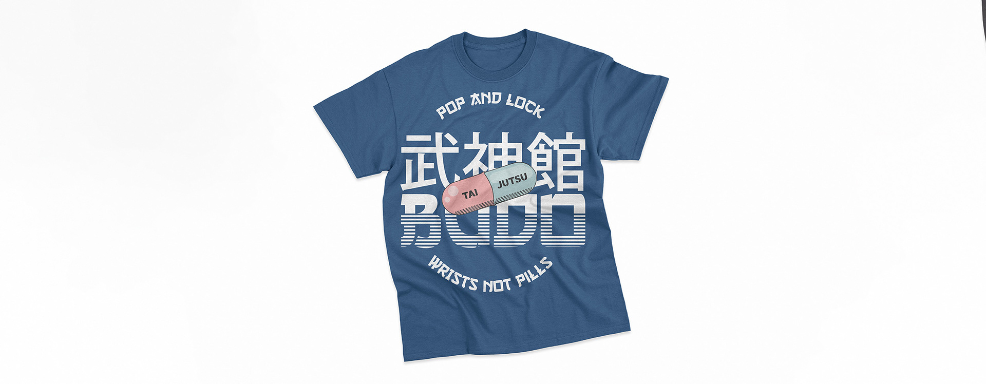
The "pill" design below is combining several things together. The Bujinkan is said to help maintain the body long in old age. They also don't allow members to take any sort of illegal drugs or substances. It also ties into the use of joint locks, a series of techniques in the art. Lastly its a fun reference to the Akira anime from Japan.


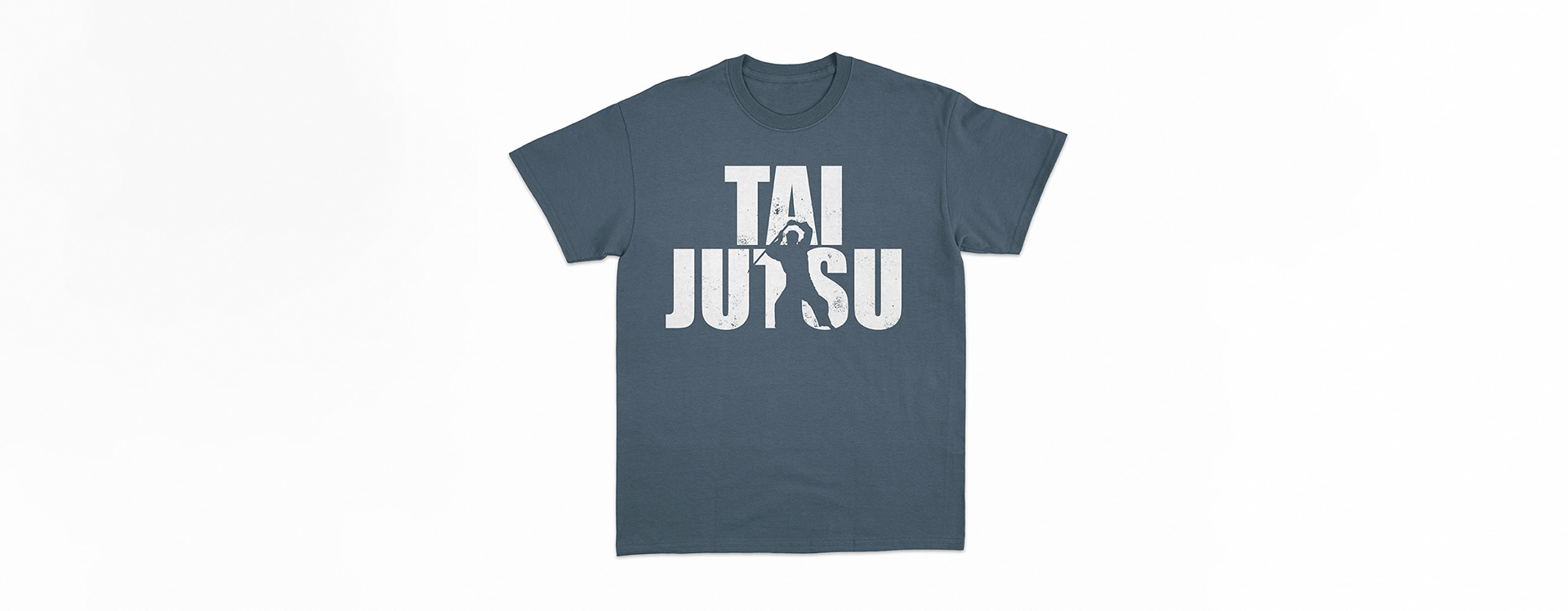
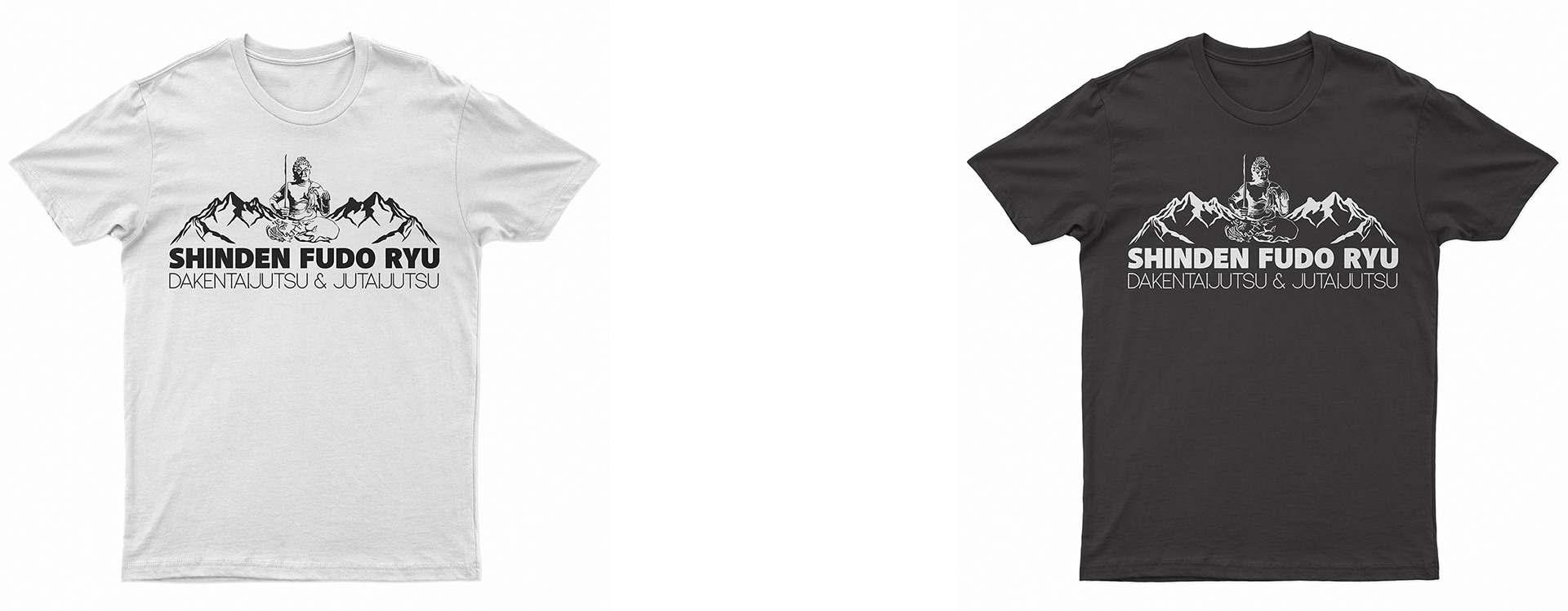
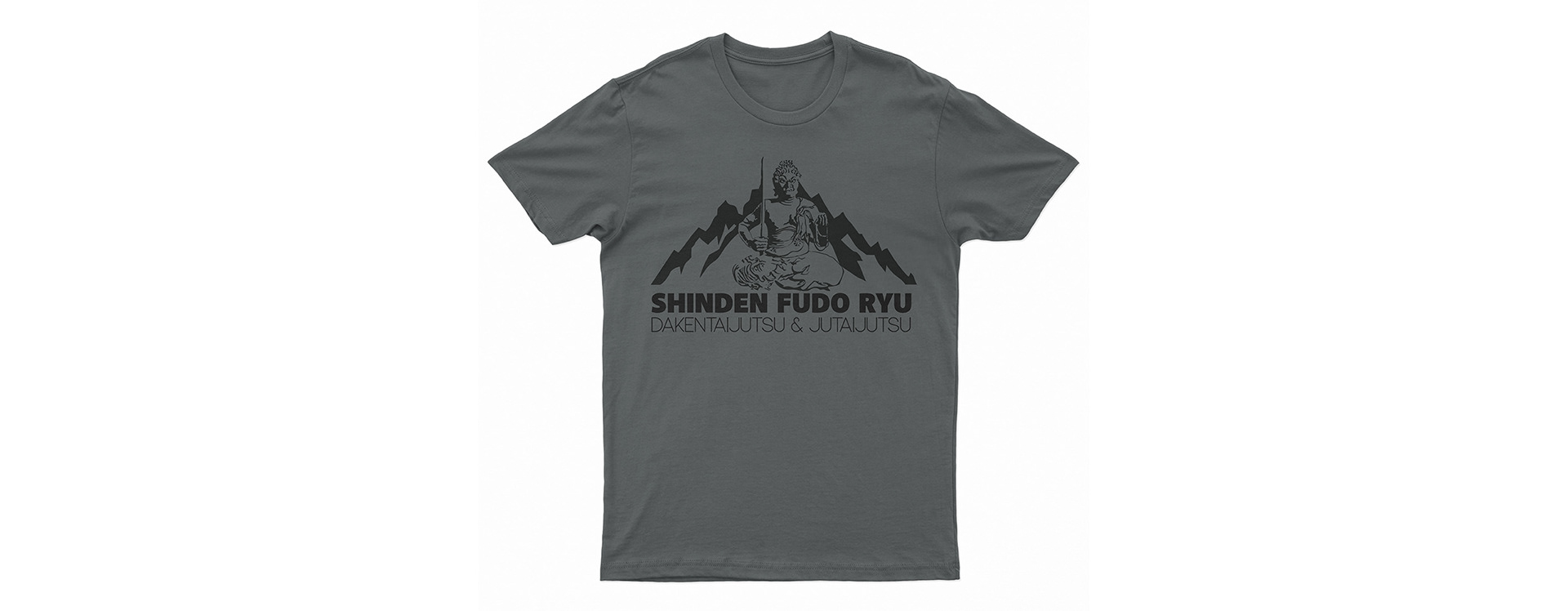
Below are other apparel designs including an alternative shishi, a couple of designs representing one of the nine schools in the Bujinkan, one simply saying taijutsu with an out line of someone blocking with a sword and one personally branded with the dojo banner on it.